Author of The Digital Apocalypse
Menu
Posted on April 29, 2021 by David Ian Groves
Leave a Comment
https://bit.ly/3taK5kd
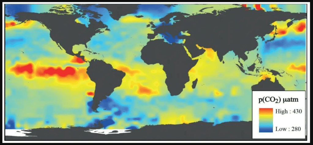
A map of CO2 emissions from the oceans, the red and yellow areas show the highest emissions, many of these are deep-water upwelling areas.
Category: Uncategorized
Fill in your details below or click an icon to log in:
You are commenting using your WordPress.com account. ( Log Out / Change )
You are commenting using your Facebook account. ( Log Out / Change )
Connecting to %s
Notify me of new comments via email.
Notify me of new posts via email.
Δ
Enter your email address to follow this blog and receive notifications of new posts by email.
Email Address:
Follow